Coded Visualization
A dissertation by Tanyoung Kim investigating the use of computational visualization to encode cultural meaning
A dissertation by Tanyoung Kim investigating the use of computational visualization to encode cultural meaning
Tanyoung Kim was a member of the Public Design Workshop from 2010-2013. She conducted research on visualizations, and for her dissertation she explored the confluence of rhetoric and aesthetics in computational visualizations. To do so, Kim coined the term, “coded visualization” to encompasses the dual meaning of code— its semiotic function and computational production.
Kim defines coded visualization as a databased and cultural interface. The visual form of this interface is an aesthetic space where messages are coded through a computational process that is interpreted using cultural references. Based on this definition, she developed a series of criteria that can be applied to the design of coded visualization.
As a research-through-design project, the dissertation work also included the design and evaluation of a demonstrative coded visualization.
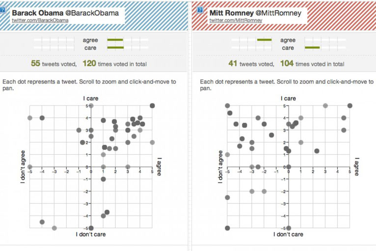
The Political Grid project was a Twitter-based website where people respond to the tweets of politicians running for office. The site was launched for the 2012 United States presidential election and followed the tweets of the two leading candidates, Barack Obama and Mitt Romney (@BarackObama and @MittRomney). Upon registering at the website, users view the tweets side by side and then can choose to “vote” on any tweet based on two standards—how much she agrees with the idea expressed in the tweet, and how important it is to her. Each vote is cast along a scale, and then placed in a corresponding location on a grid. Once the user votes on a given tweet they can see the results of others’ vote on that same tweet, and across all of the tweets for a particular candidate. They can also compare the candidates side by side. Finally, the interface provides a simple word cloud that expresses the relevance of terms within the tweets for each candidate
Building upon current trends in visualization, using Political Grid provided opportunities for reflection through visualization at multiple levels. This occurred first at the individual scale, as a user can examine her political preference and the voting results of each tweet or voice in a greater detail. At a broader level, among the collective of Political Grid users, one could compare votes, word frequency of tweets, and the temporal trends of voting.
What the design of the Political Grid attempted to do, then, is draw attention to affective aspects of contemporary politics through familiar channel of social media and relatively simply visual forms. This purposeful and direct engagement with affective orientation is in contrast to much of the common treatment of politics in interaction design that strives for rational deliberation. This approach emphasized the affective character of politics and argued that it is imperative to acknowledge and allow for affect in political discourse. Rather than displacing the affective quality of politics, Political Grid put it front and center.